Gain deeper insights into a sprint with monday dev's Agile Insights. Agile Insights empowers scrum masters, team leaders, and more to track team achievements, commitments, and performance. Read on to learn more.
What is Agile Insights?
By utilizing historical data from the start and end of each sprint, Agile Insights allows you to use trend analysis to enhance your sprint planning and retrospectives.
Agile Insights takes a snapshot of your team's progress at the beginning and end of each sprint so you can visualize and compare your team's achievements with their initial goals.
With these charts, you can learn about performance, how much can be delivered over the course of a sprint, and how many out of the tasks are added during each sprint. As sprints are added and completed, you can learn over time if you were able to improve performance or not.
How can Agile insights help improve efficiency?
There are many ways that Agile insights can help enhance your sprint planning. Here are a few examples for specific use cases:
A team manager or scrum master can use the charts to track the team's overall performance throughout the sprint and take away insights to help improve processes in future sprints
All team members can review these reports and come up with ideas for their own improvement in upcoming sprints. This can be done as part of a retrospective as well
Group managers can generate a report per team and compare different teams challenges and abilities in order to make relevant adjustments
Agile insights also supports an active sprint, giving you insights even before the sprint has been completed so you can proactively make decisions about your sprint:
How to add Agile Insights to your board
Agile Insights is a board view with built-in charts available on monday dev Tasks boards. The built-in charts provide critical visibility into action sprint performance.
To add Agile Insights, click on the plus sign icon on the top of your Tasks board and then click on Agile insights:
You can add additional charts to your Agile insights view or any dashboard using the + Add widget button:
You can also add the individual Agile Insights charts as a separate view from the Views Center:
Read on to learn more about the charts included in the Agile insights view.
Velocity chart
With this chart you can track your completed work per sprint over time to identify trends and forecast future performance.
- The Committed bar is calculated the moment you click on start sprint. Once you add more SP to the sprint, it will no longer count towards the committed bar calculation.
- The Completed bar is calculated by all the tickets that were marked as Done once you end the sprint. You can define which labels count towards Done in your settings.
Planned vs. unplanned chart
With this chart you can analyze the distribution of work between planned and unplanned tasks to assess planning accuracy and identify areas for improvement.
-
- At the beginning of each sprint, tasks that are not marked as Done and are planned to be completed during the sprint are counted.
- At the end of the sprint, the tasks that were added to the sprint before the Start sprint button was clicked are included in the Planned bar.
- The tasks that were added during the sprint are then counted towards the Unplanned bar.
- There is also the Removed bar that includes any tasks that were removed during the sprint as they were either moved to a future sprint, deprioritized, or deleted altogether.
- Tasks that were not completed during the sprint will be included in the Unfinished bar.
Burndown chart
With the Burndown chart you can view a graph of your team's efforts and tasks that have yet to be completed from the Tasks board.
Take a look at our The Burndown Chart article to learn more.
Sprint recap widget
This sprint snapshot widget provides you with a historical view of your completed sprint with a complete record of all your sprint's tasks (items column values).
The snapshot begins from the start of a sprint until it is marked as Complete.
The recap chart calculates the final, accurate story of your sprint by showing you:
- Completed - tasks finished within the sprint
- Uncompleted - tasks still open at the sprint's end
- Unplanned - tasks that were added after the sprint started
- Removed - tasks that were removed before the sprint was completed
To access the recap, open up Agile insights, where you will find information for your past 6 sprints. Then click on any sprint's bar to open the detailed Sprint Recap chart for that specific sprint.
This chart allows you to drill down and see the final state of every single tasks at the moment the sprint ended:
Group charts together
When managing multiple boards or teams, you can group charts together with each focusing on a different board or team. This gives one place to look to:
- see insights from multiple boards
- track performance across different teams
- spot trends and compare performance across projects
- save time by avoiding the need to switch between boards

Whether you're a team lead juggling multiple projects or working to give your stakeholders high-level visibility, grouping charts allows you to get a holistic view of all teams and boards in one place.
Customize chart settings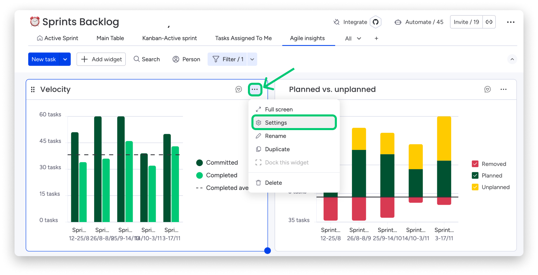
Here you can select the way your data is displayed on your charts. Each chart features a variety of Widget Settings that will help you customize the way your data is shown.
If you have any questions, please reach out to our team right here. We’re available 24/7 and happy to help.