


If you ever walk into a monday.com office, you will see dashboards everywhere! We like to measure everything from the company's performance to the amount of coffee drank per week ☕️. Reporting plays a crucial role in any decision we make. With that in mind, we've created some pretty amazing features that will help you run reports on your boards and your entire monday.com account.
In this guide, we will walk you through our advanced functionalities such as stacked charts, Pivot Table, Workload View, and more! If you are new to reporting, we recommend you read our basic reporting guide right here. Let's get started 😃
Visualize data using three parameters with stacked charts
Charts are great way to see the analytics side of your workflow. See how well your team members are performing, how fast your tasks get done, how they change over time, and more.
In this example, we are using a sales pipeline to visually track the progress of all the deals our sales team is currently working on.
We are interested to see how much sales each agent made in the month of April. To do so, we will use the stacked chart. The X-axis represents each agent while the Y-axis represents the amount closed in USD.
Our third parameter is used to better understand which type of plan is sold the most per specific agent. For example, we can see that Shelly is the only agent performing really well in selling Enterprise plans whereas Lea is great in selling both Pro and Basic plans.
Add a benchmark and cumulative data
Let's enhance our chart even more by using a benchmark and cumulative data. The cumulative data option allows you to show how the data you are reporting on progress over time. Each month will include all previous months plus the addition of the current month.
To go back to our example, we can use the cumulative data to show the progress of the sales team per month. Our X-axis represents the months while the Y-axis represents the total amount closed in USD. We've stacked our chart per agent.
With the cumulative data, we can easily see the great progression of the team over the months.
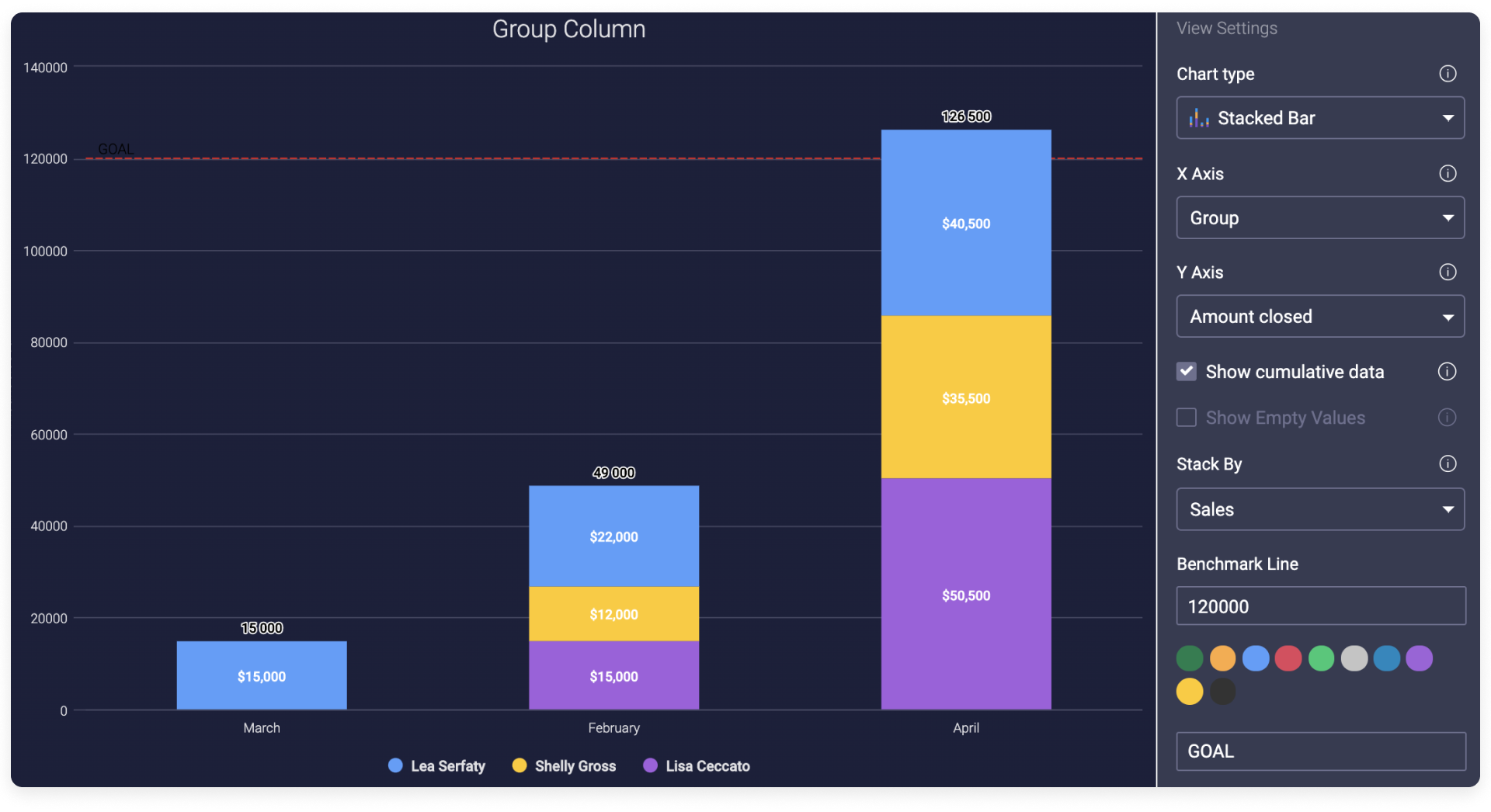
You can also add a Benchmark line to display the goal or the low/high threshold so you can keep track of your numbers in comparison to that line. 🙌
Get a clear overview of your team's workload
Managing your resources and making sure to allocate all your tasks correctly is a crucial step of any successful project. With the Workload View and Widget, you can get a clear overview of how your team's work is divided! You can see in one glance who is over capacity and assign upcoming tasks accordingly. If needed, you can always reassign or change due dates to make sure everyone stays on target with the number of tasks they can complete within that timeframe.
In this example, we are launching a new product. Our board contains the following columns:
- A People Column
- A Date Column (you can also use a timeline column)
- A Numbers Column to indicate effort required for each task (you can also use a formula column).
It is important to have these columns in your board for the workload view/widget to work.
Once your board is ready and your tasks are assigned, you can open the workload view. You can display the data in two ways: count item and effort.
- Count Item - If you choose Count items, each item that is assigned to that person will be counted as 1 and displayed on the board.
- Effort - Sometimes, some of our tasks take more effort or carry more weight to the project. In our use case, we are using the time estimation column. That setting works with both a Numbers or Formula Column.
Weekly Capacity - Once done, we can then choose a Weekly Capacity for the entire team. This will be the limit of how many hours you want the team to be working on those tasks in that week. In our example, we set up the weekly capacity to 5 hours per week.
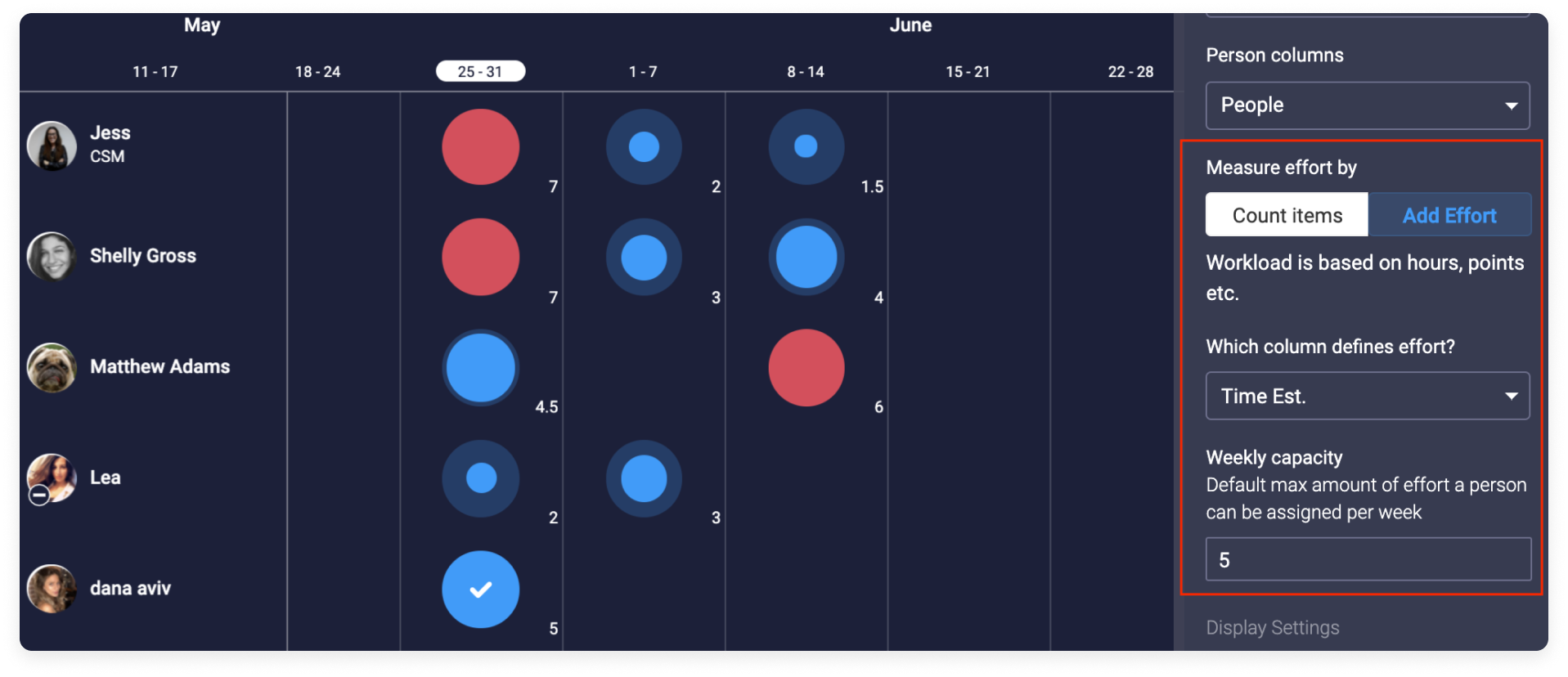
In one glance you will be able to see how your work is divided and who's over capacity so you can reschedule or re-allocate work as necessary to ensure timelines can be met. Check out the Workload View and the Workload Widget articles for more details about how this works.
Stay on top of your schedule with the Overview Widget
With the overview widget, keeping track of your projects has never been easier! This widget analyzes the status of an entire board based on the number of remaining tasks to be done and the overall timeline.
To set it up you simply have to pick the status column and the date column you wish the widget to draw information from and if you wish to exclude boards or only pick specific groups.
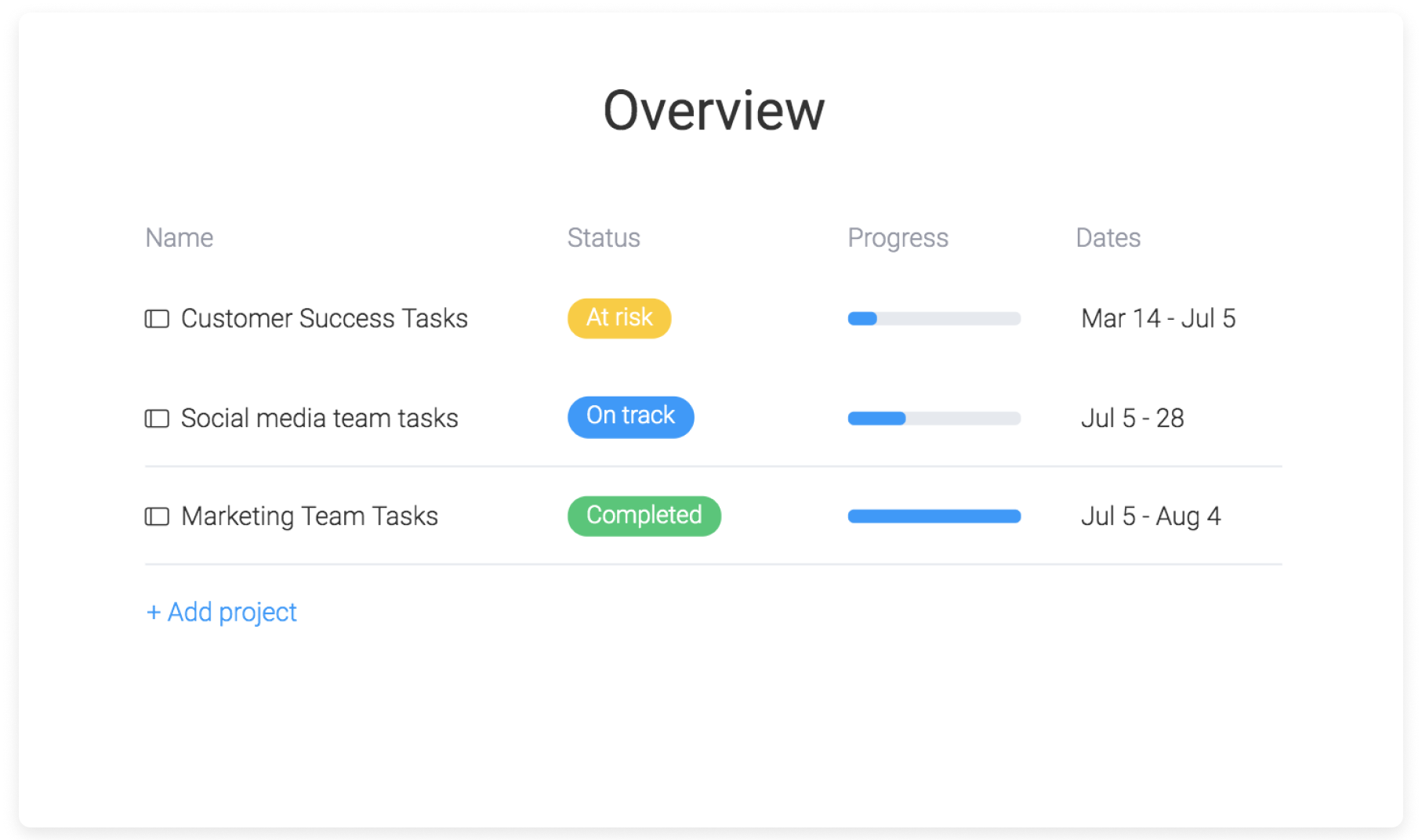
- If all your tasks are on time, your project will show "on track"
- If everything is done, then your project will show "completed"
- "At risk" projects will be determined by measuring the percentage of time that has passed between the start and end dates of all projects and the percentage of "Done" tasks on that same board and compares them.
This widget is great to see a clear picture of the overall progress and helps you stay aware of any risk or delay in schedule.
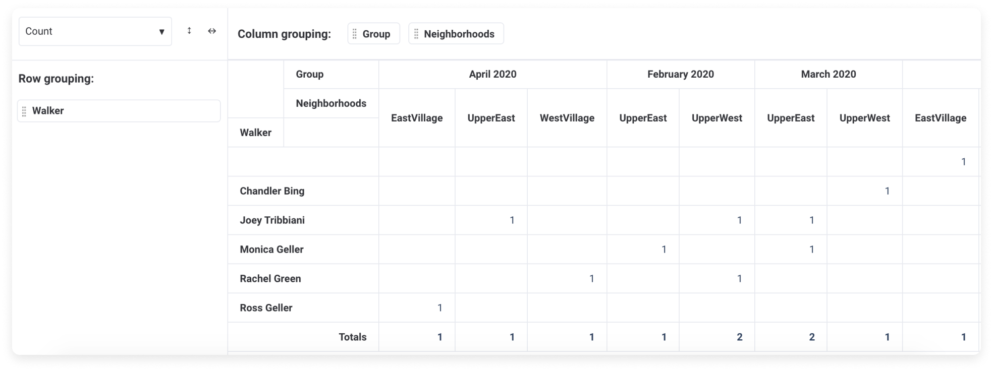
Slice and dice information with the Pivot Board
Our Pivot Board View will allow you to better analyze the different verticals of your board by slicing and dicing the information. Being fully flexible and customizable, this view will enable a deeper level of reporting from many different perspectives.
In this example, we are managing a dog walking company. We are interested to see how many dogs each walker was assigned to per month. 🐾 Each row will be a dog walker and each column will represent a specific month.
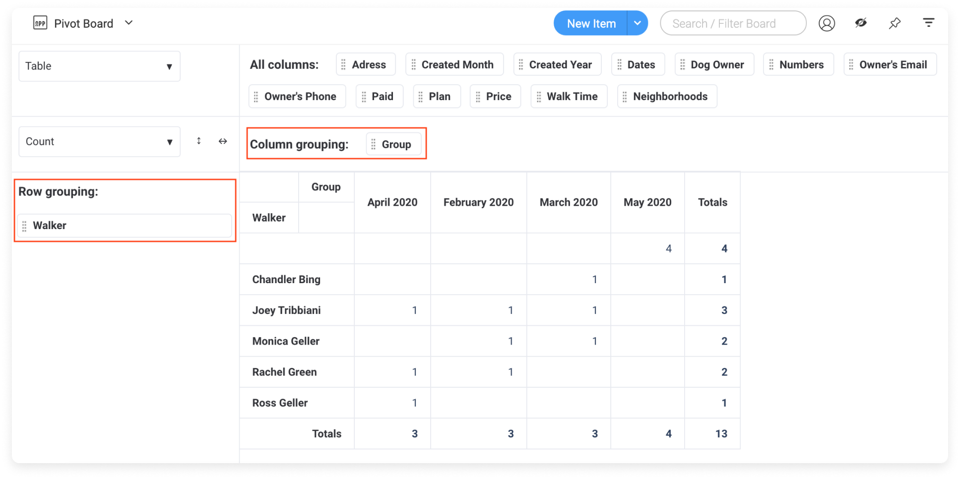
You can even add multiple layers! This will allow you to gain a deeper analysis and identify trends on your board. Here for example, we have our columns split per month and per neighbourhoods .
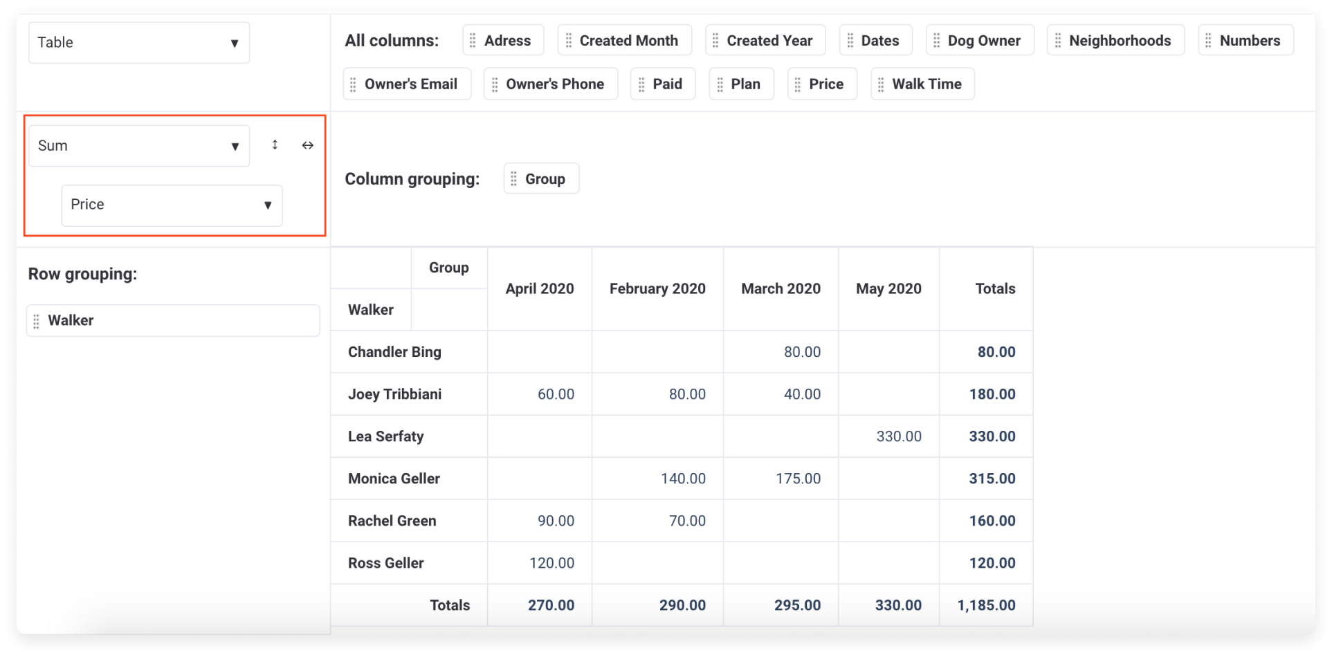
Finally, you can summarize your data by the sum, average, median and more! On the top left of your pivot click on count as below and select your preferred setting. In this example, we are interested to see how much each dog walker earned each month. We will choose sum and then price. Et voilà 🙌 Now we can see in one glance how much each dog walker earned
The pivot board is a super flexible tool that will help you summarize and manipulate your information in many different ways so you can identify trends, follow your processes and analyze your data better than before!
Track down your team's performance
With our Performance Insights View, you can now track how long your items spent on a specific status or in a specific phase and better analyze your productivity!
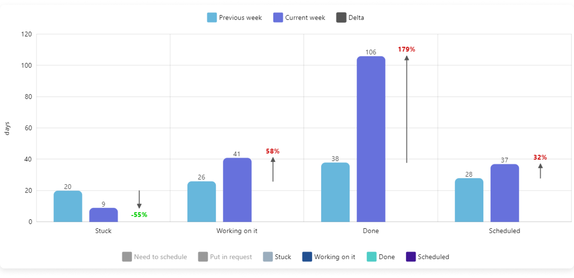
Here you will be able to see how much time was spent on the different statuses and the change with time. You can get valuable data on your team’s tasks and see at a glance where projects get stuck , manage your team based on clear actionable data and keep your team motivated and performing at their full potential. 🙌
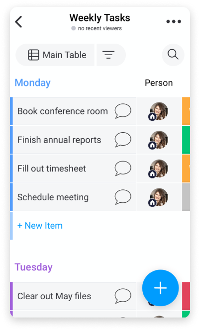
View and update data on the go with the mobile app
The mobile app will allow you to collaborate with your team right from the palm of your hand! It's perfect if you're on the go and want to stay in tune with your team members. View your dashboards, board views, and boards, and pull your mobile out of your pocket to update information the minute it becomes relevant! You can even use the mobile app in offline mode to collaborate with your team from the field, or even on the subway on your commute to work! Check out this article to get started!
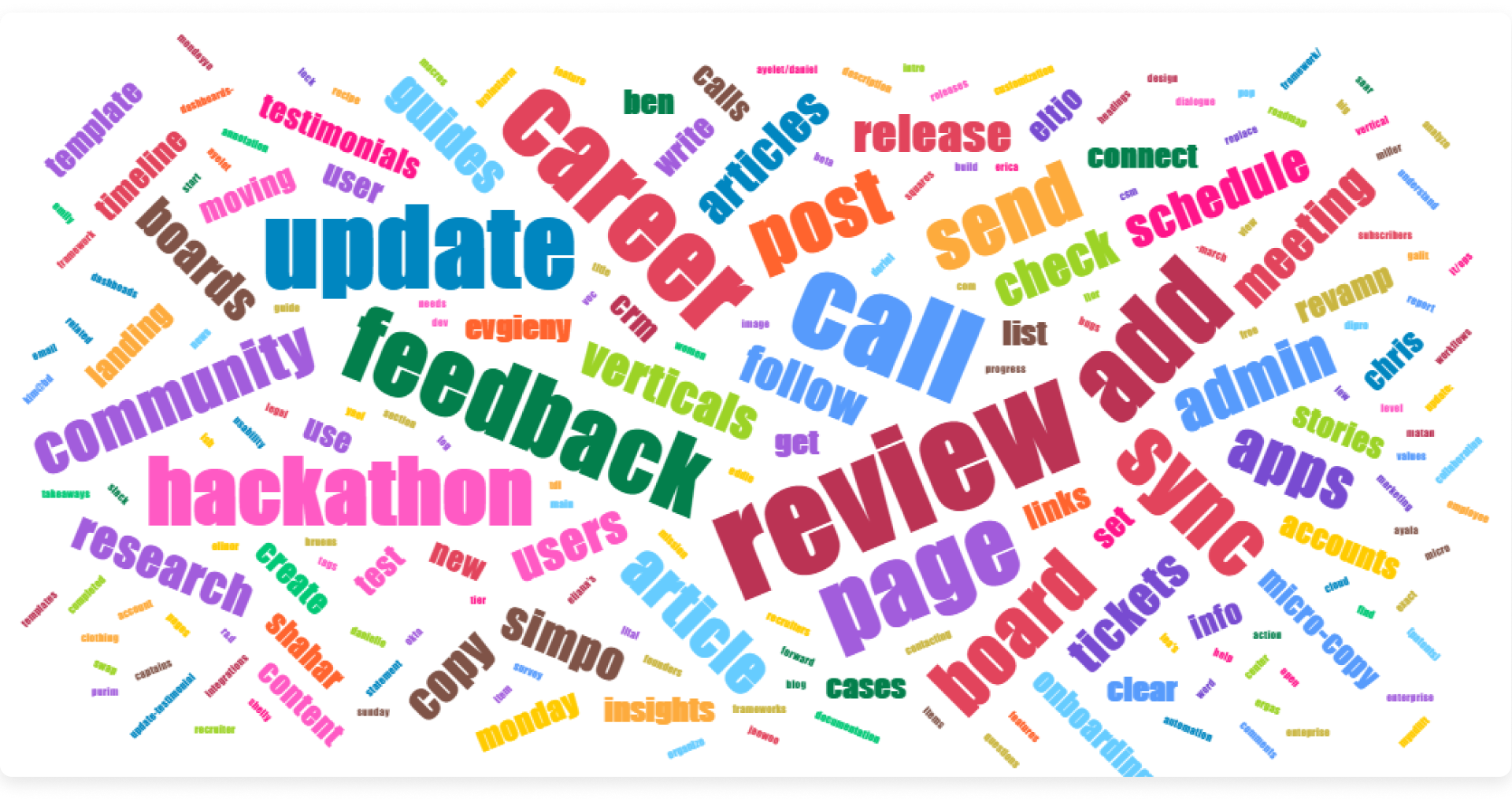
Identify textual sentiment at a glance
With the Word Cloud, you can turn your textual data from your board into meaningful visualizations allowing you to gain in-depth analysis and convey crucial information when necessary.
The Word Cloud helps turn databases of textual information into insights by depicting the key terms from your texts in a stunning visual representation. The bolder and bigger the terms, the more these terms appear on your board. With just a quick glance over your word cloud, you'll be able to gain some key takeways and insights!
All these amazing functionalities should help you get the most out of our data! 😃
If you have any questions, please reach out to our team right here. We’re available 24/7 and happy to help.
Comments