


 3 min read
 Feature
Looking to track your own and your teams performance on certain projects? Wouldn’t it be great to be able to track how much time the creative phase took compared to the production phase, or how long it took to close your sales deal? With our Performance Insights View, you can now track how long your items spent on a specific status or in a specific phase and better analyze your productivity!
How to add this view?
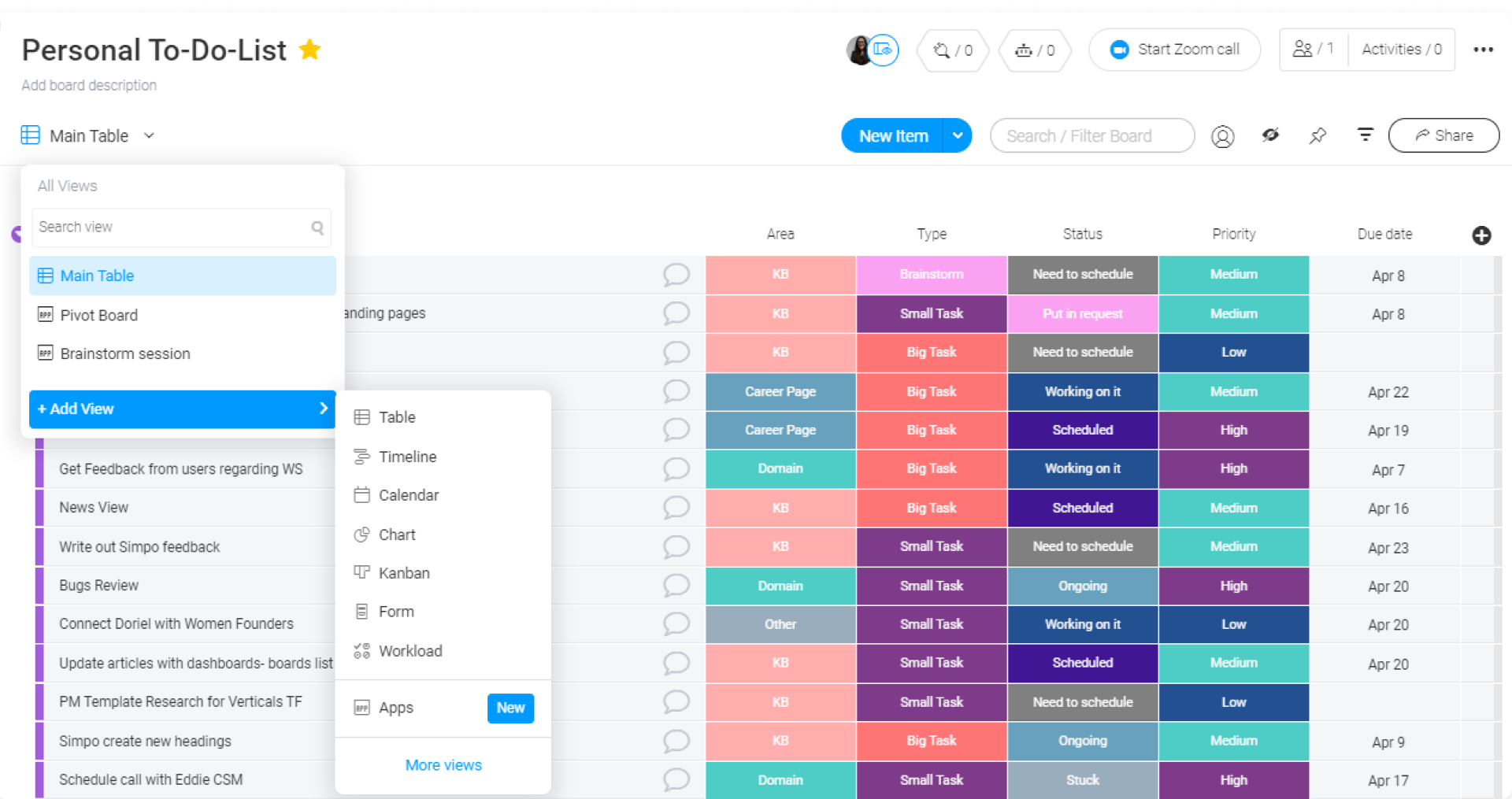
To add the Performance Insights View, click on the arrow next to the button "Main Table" located on the top left of your board. Click on "Apps" on the bottom of the menu. This will take you to the Apps section of the views center, as you can see below:
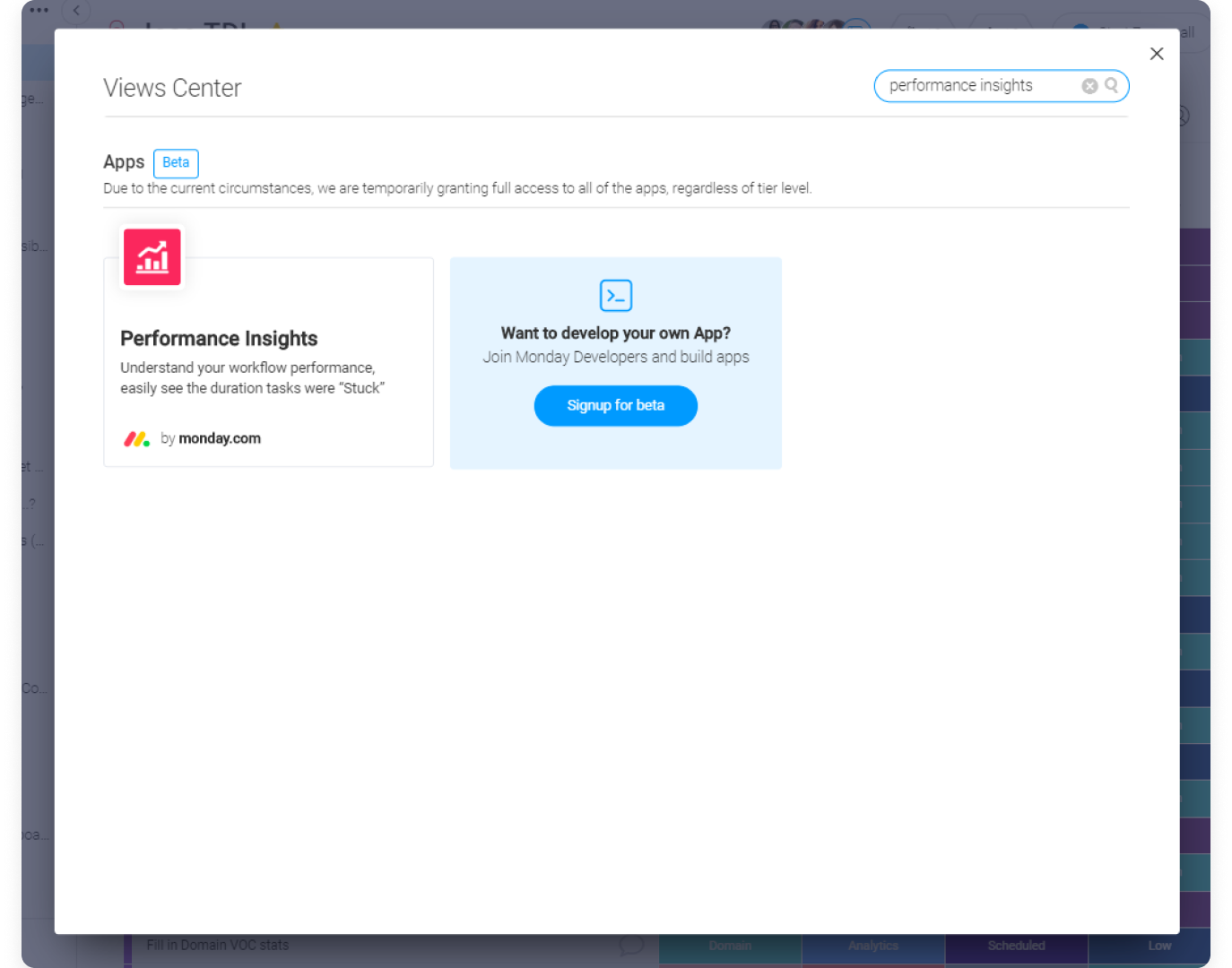
Then go ahead and search "Performance Insights" and add it to your board.
Once selected, you will find a bunch of different settings allowing you to customize your view to reflect the information you're looking for.
How does it work?
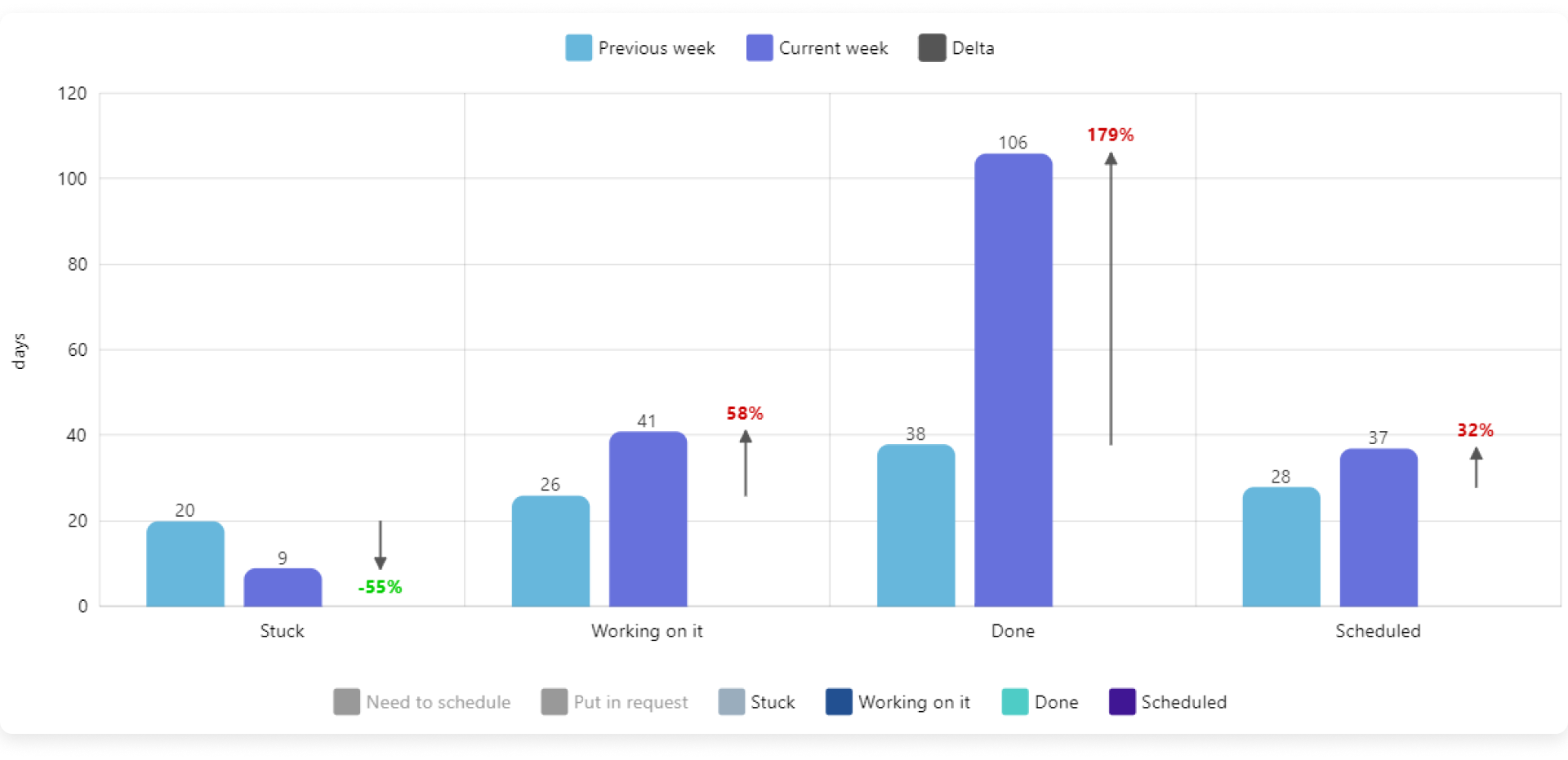
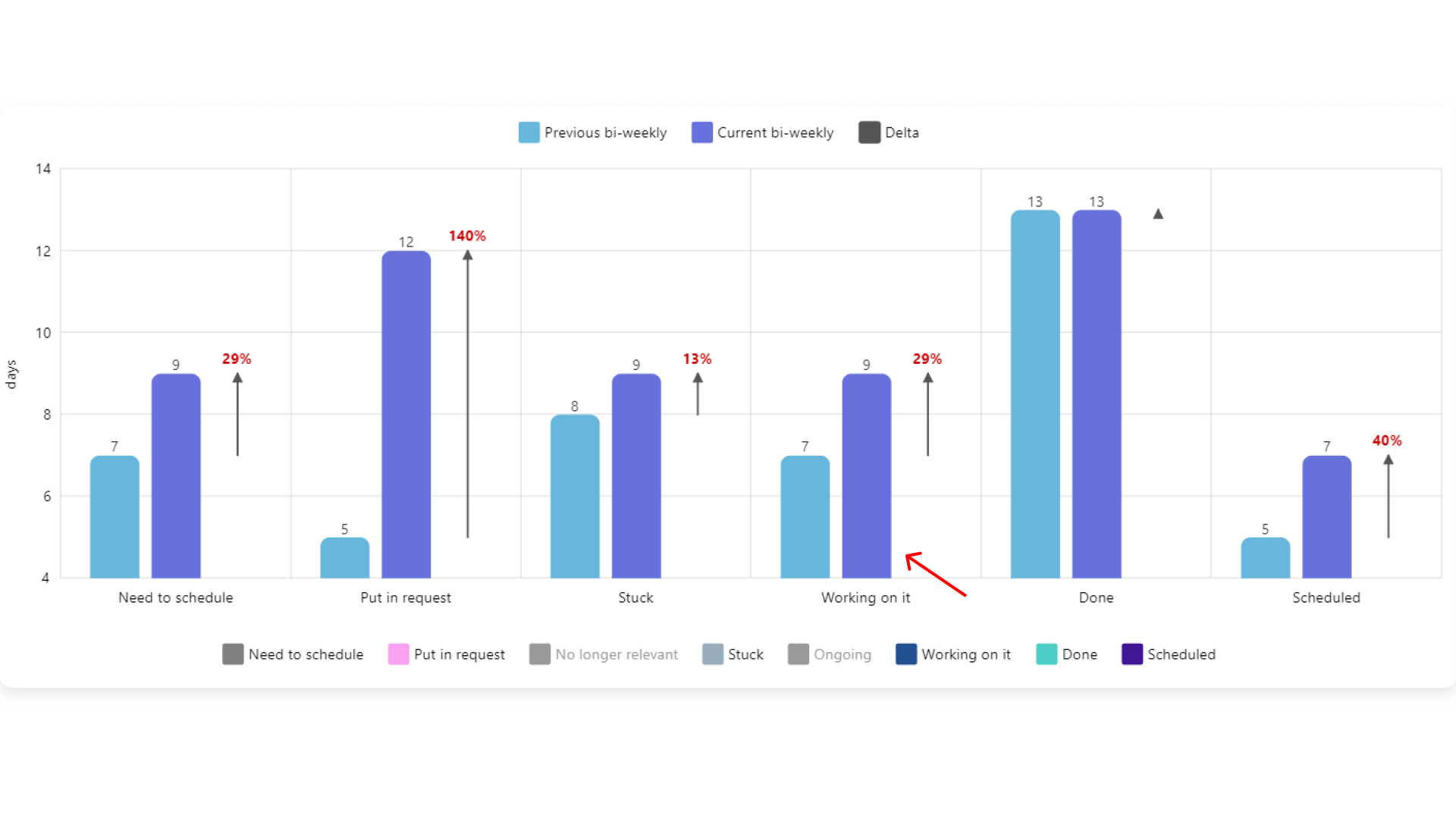
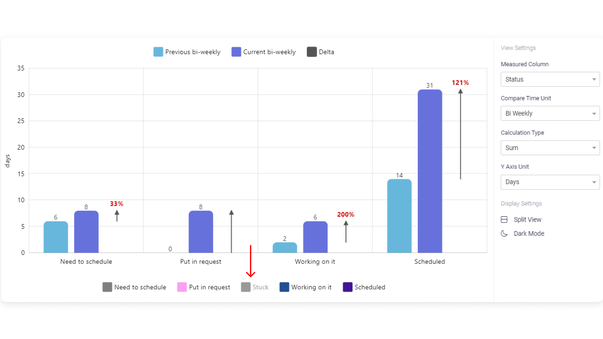
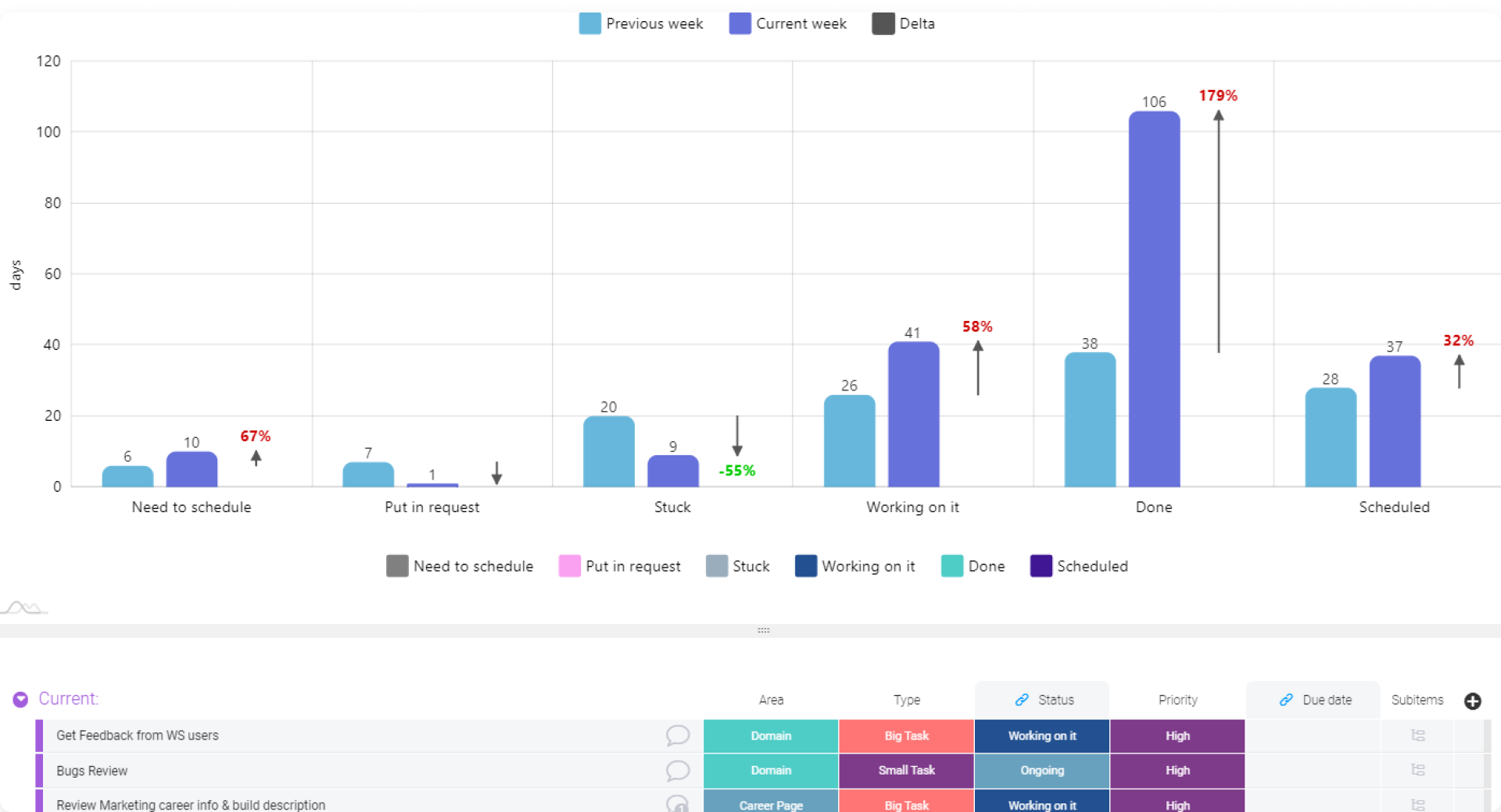
Once you've set up your Perfromance Insights View (see how below), you'll be able to track and compare the time spent on specific statuses for any given time period. The duration information reflected will be pulled from the Activity Log on your board. If there was no status change in the Activity Log within the time period you've selected, the information displayed will be based on the item's status label at the time of the start of the time period until the end of the time period (ie. now).
When analyzing your graph, make sure to look at the status label of interest, to understand how much time was spent on it. For example, if you're interested in seeing how much time was spent working on a project before it was completed, you would need to look at the status label "working on it" and not "done".
How to customize it?
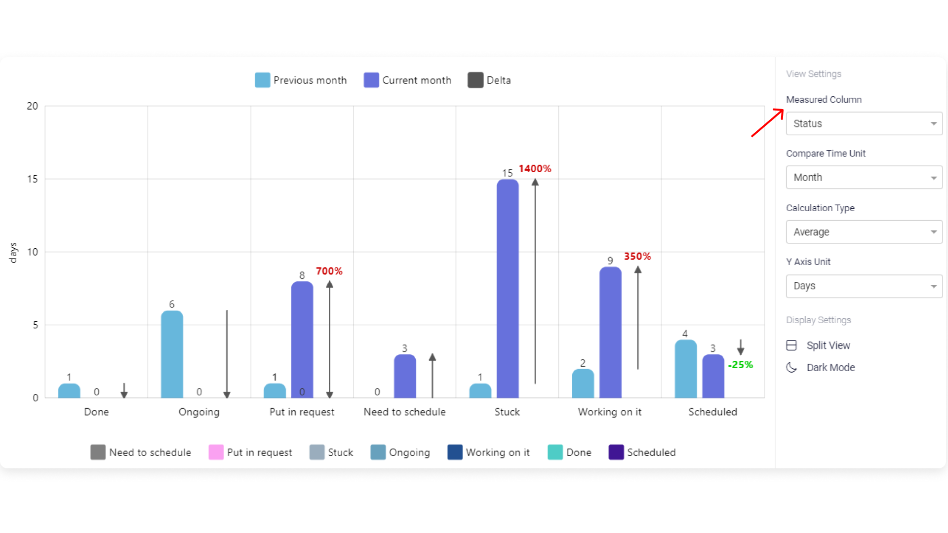
Step 1: Choose the status column that will be measured
Here, you can select which status column you'd like to measure. Whether you're interested in learning how much time your projects remain in certain phases of the process, in certain priorities or anything else.
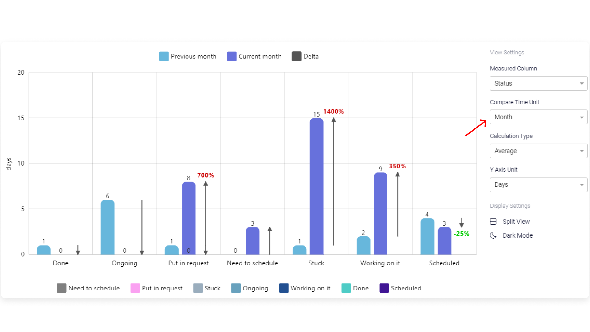
Step 2: Choose the Time Period you're interested in
This refers to the time period that you're interested in analyzing and comparing. For example, if you would like to see how much time was spent in each status phase of your project over the past month, and compare it to the previous month, select "Month".
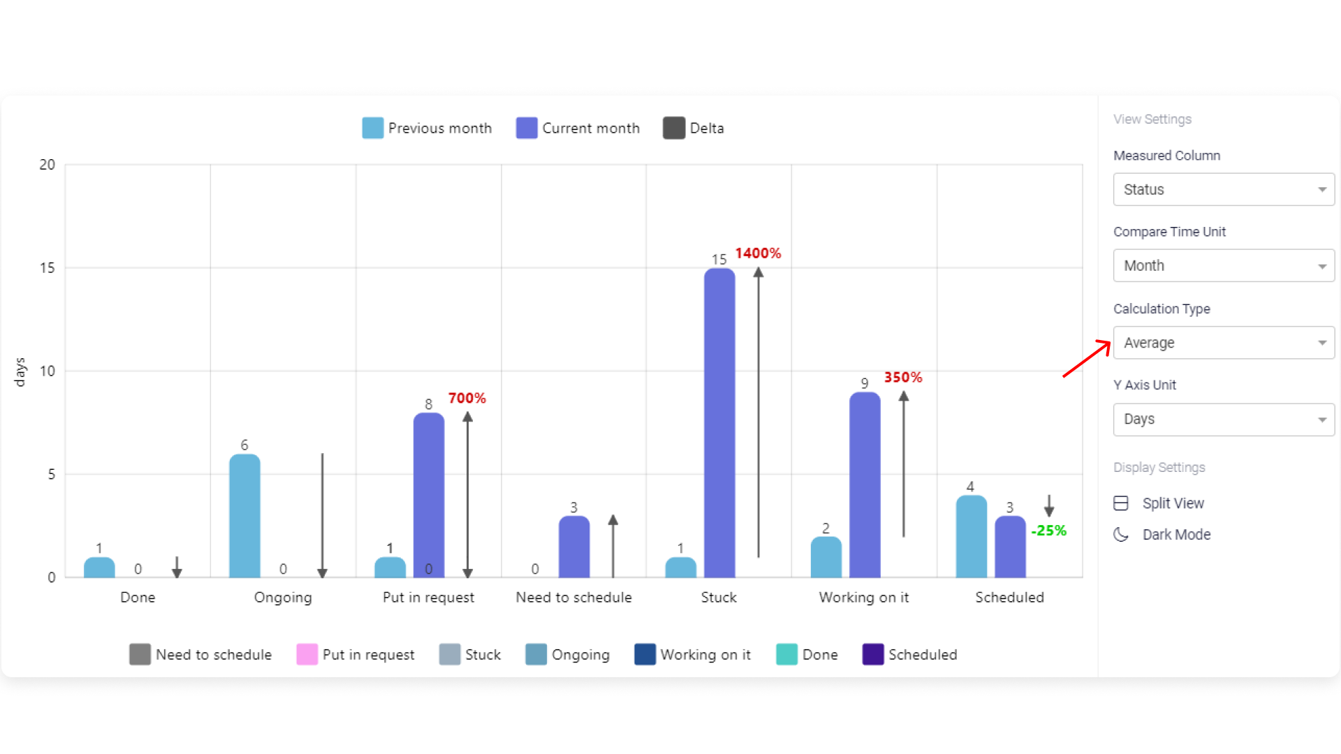
Step 3: Select the Calculation Type
Here, you can define whether you'd like to see the average time spent on a status or the cumulative time spent.
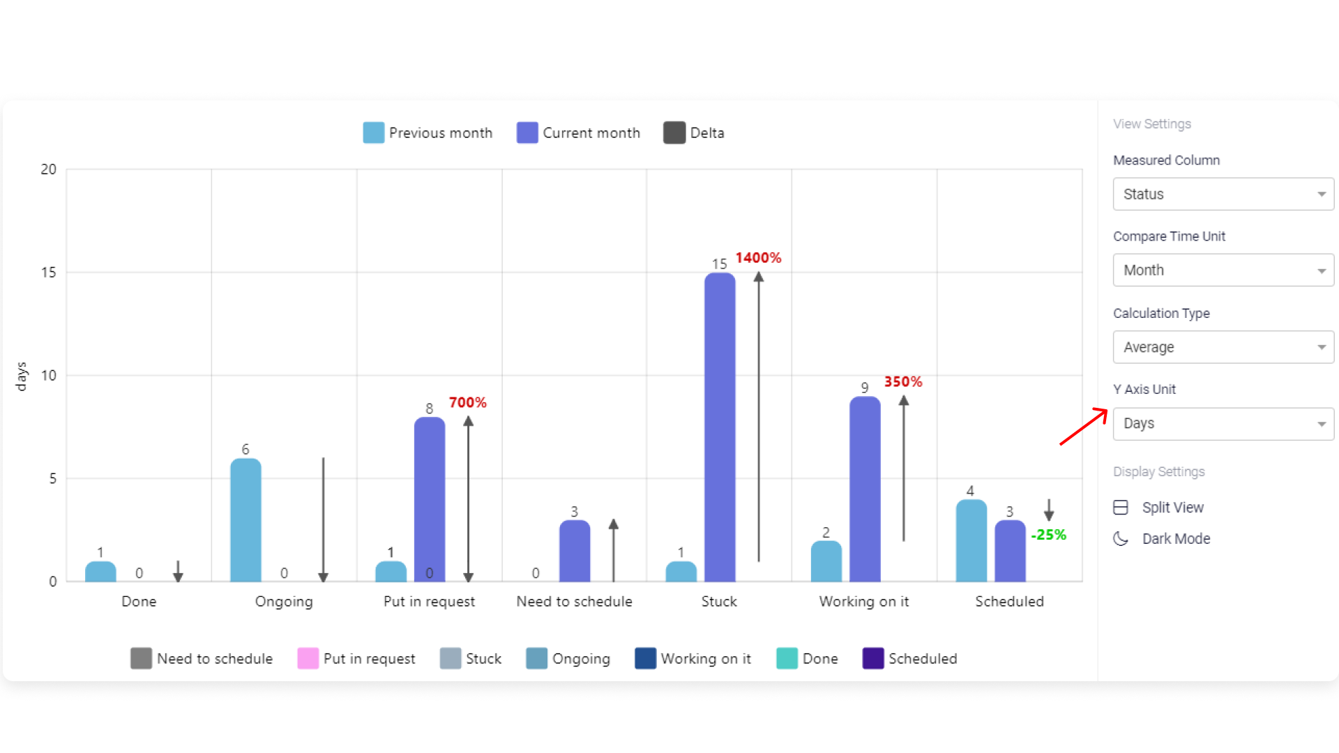
Step 4: Select the Y Axis Unit of Measurement
Whether you'd like to view your average or cumulative value in weeks, days, hours or minutes, you can define this here to fit your exact needs. We're interested in seeing the average number of days spent on a specific status, so we've selected "Days".
Step 6: See a Drill Down of your Data
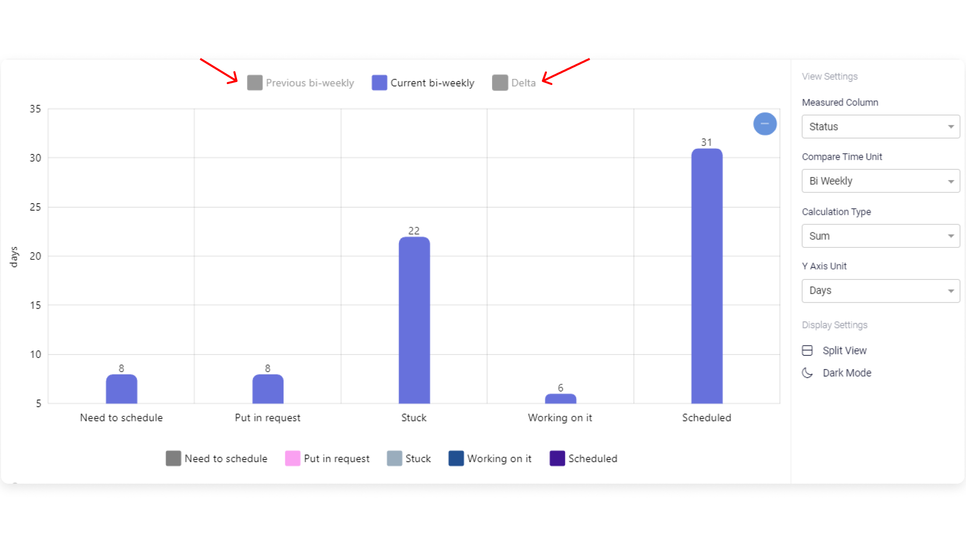
If you want to have a closer look at the data and get a more focused view, you can temporarily remove irrelevant labels on the graph, simply by clicking on the status label itself (at the bottom of the view), helping reduce noise. Let's say we're interested in seeing all status labels except "Stuck".
To remove comparitive data or the delta option, simply click on the label itself (at the top of the view) and it will also be temporarily removed.
Filter your graph even further
You can filter directly on your graph by using the board filters. It is a great way to display the exact information you need. Let's say we're interested in seeing only the tasks on my board from the "current" group that are of high and medium priority. By selecting the relevant groups and status labels, the filter will narrow down all items that are relevant and display those only.
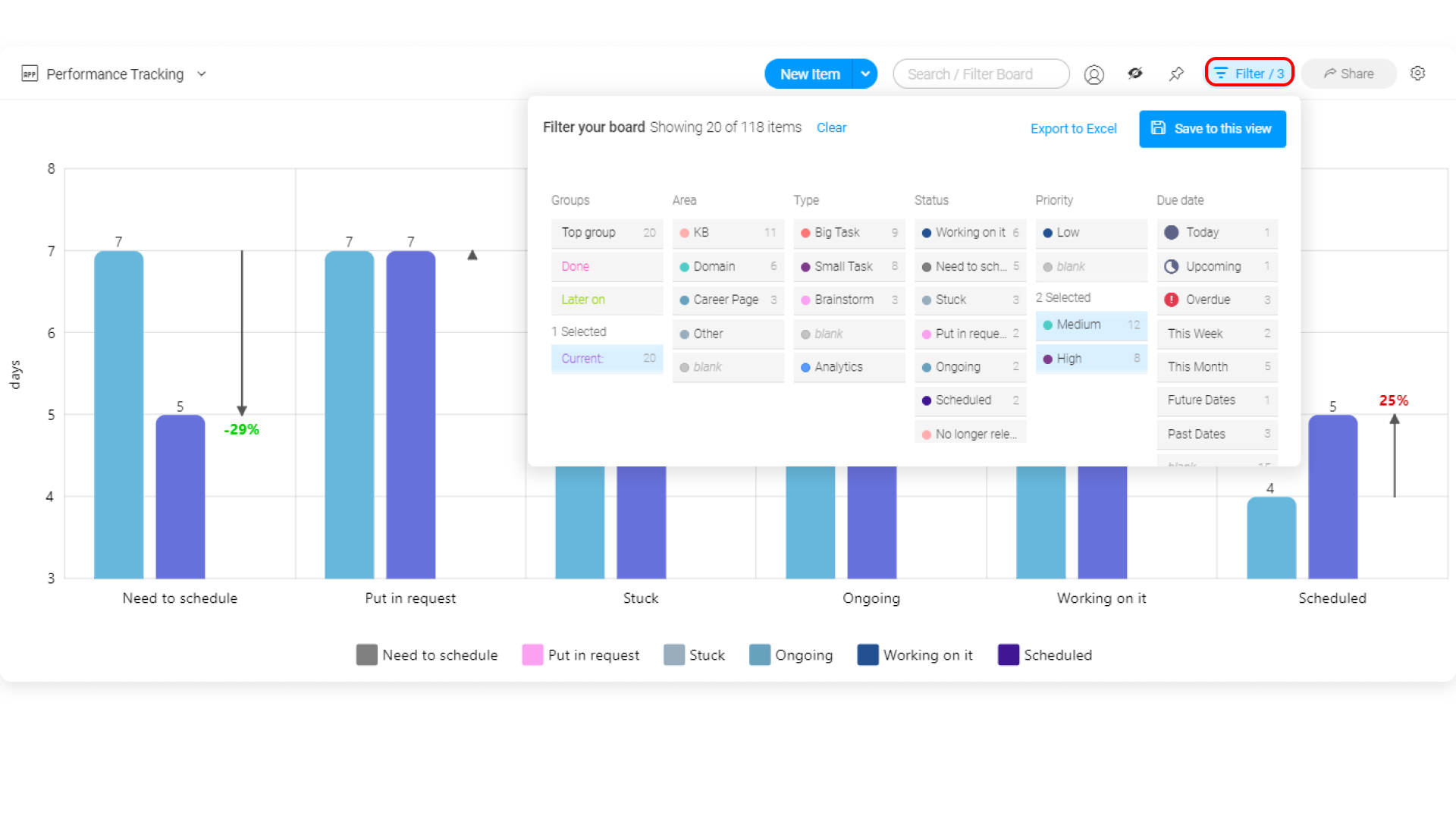
Don't forget to save your filtered view for easy access at any given time! Simply click on "save to this view" as below:
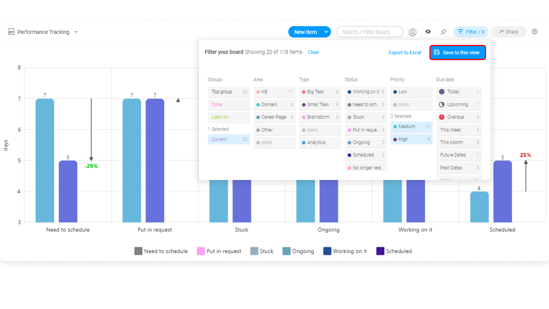
Whenever you will open your Time Spent view from that board, the filter will automatically be applied. 🎉
Display settings
Turn your graph dark or light according to your preferences by selecting the light/dark mode in the display settings. You can also pick whether you want your graph to be in full view or split view. By choosing the split view, you will be able to see your chart and the board itself on the same view as below:
If you have any questions, please reach out to our team right here. We’re available 24/7 and happy to help.
Comments
Is it possible to measure the Status column from the subitems?