


 8 min read
 Guide
Guide
Employee engagement surveys are the most important tool you have for monitoring the health of your organization, and they’re the best way to give employees an avenue for feedback. With monday.com you can simplify the process by creating your survey, collecting the results, and analyzing the data all in one place.
Schedule your surveys
The first board you will want to create will be used to schedule your surveys. This board should include the name and email address of every employee, as well as their start date and HR representative as a Status Column (more on this next). Your setup should look something like this:
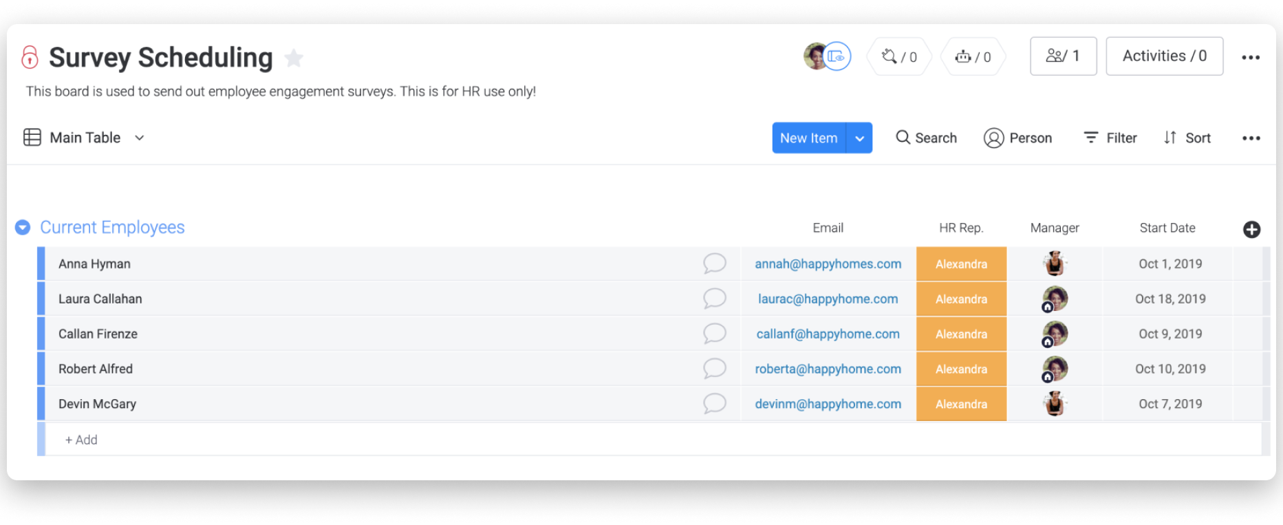
It’s important that you add new employees to this board as soon as they’re hired. This will ensure that they are surveyed properly, and their opinion is factored.
Integrate your emails
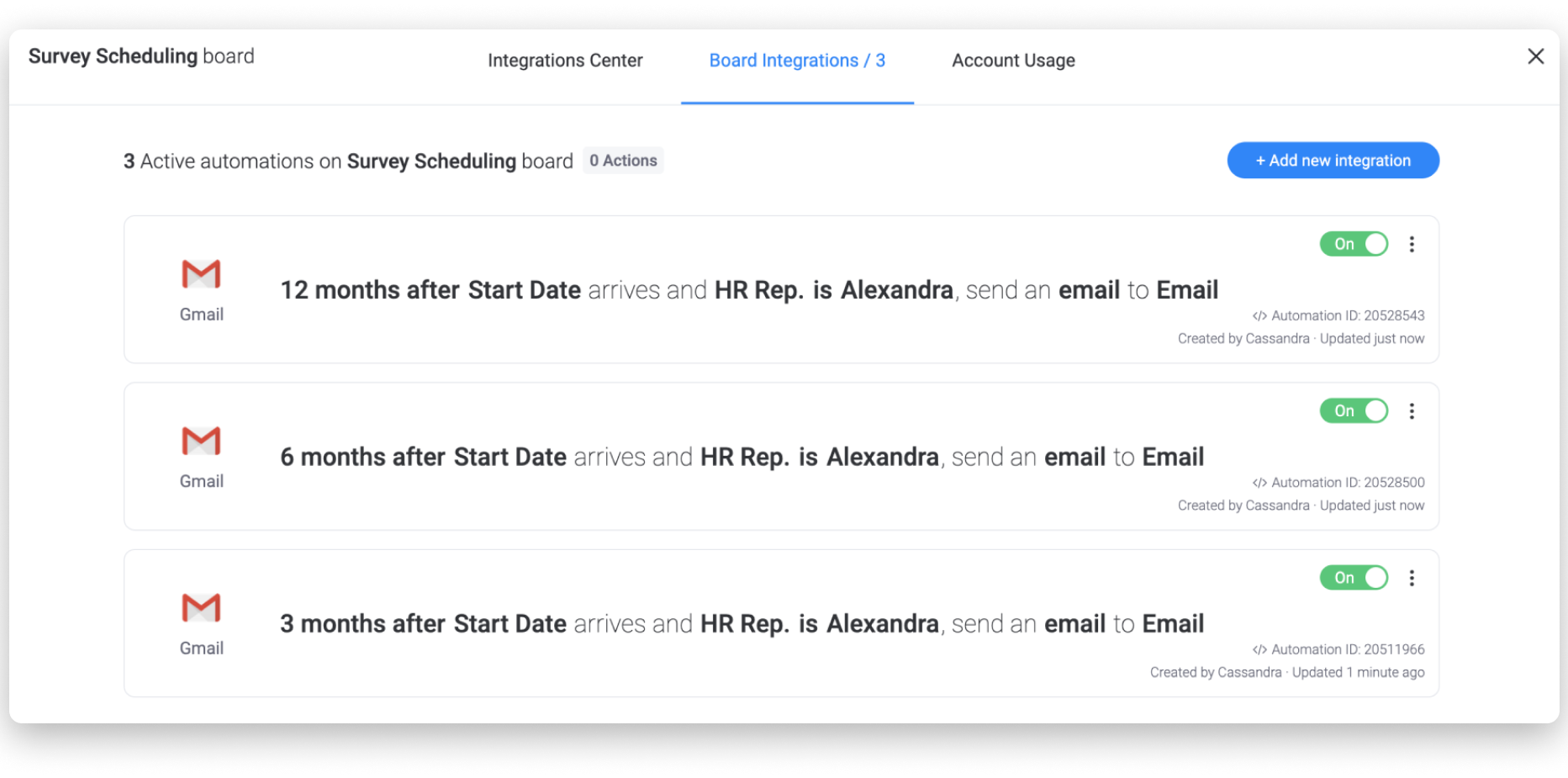
The best integration to set up for this workflow is either the Gmail or Outlook Integration (depending on what service you use). The integration recipe you’ll set up on this board will send out emails based on the employee’s start date. The best recipe: “When date arrives and status is something, send an email to someone.”
You can set up a recipe for several intervals, such as 3 months, 6 months, and 1 year into the employee’s tenure:
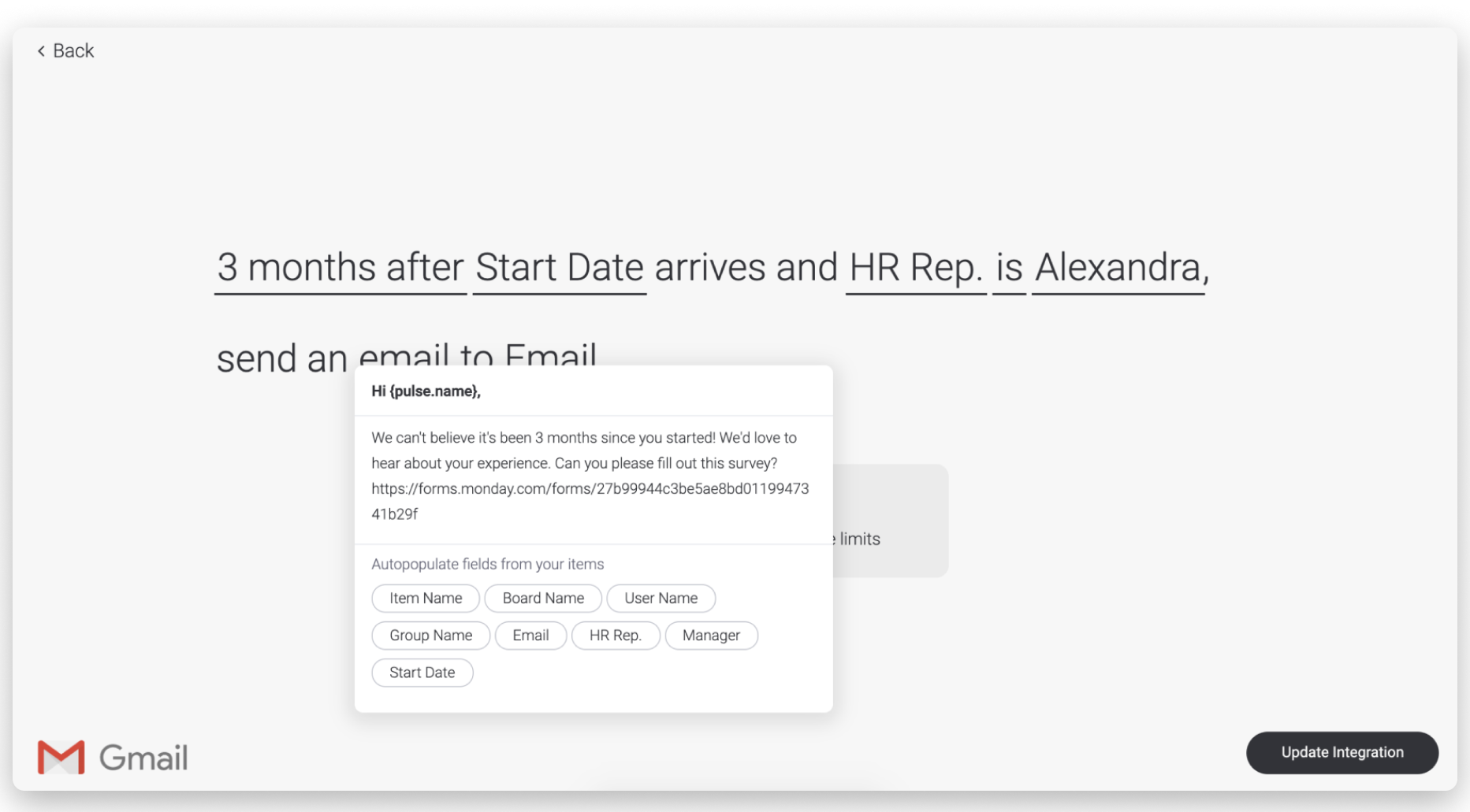
The email you send will also include a link to the employee engagement survey.
Which brings us to the next board you’ll want to set up!
Setting up your survey
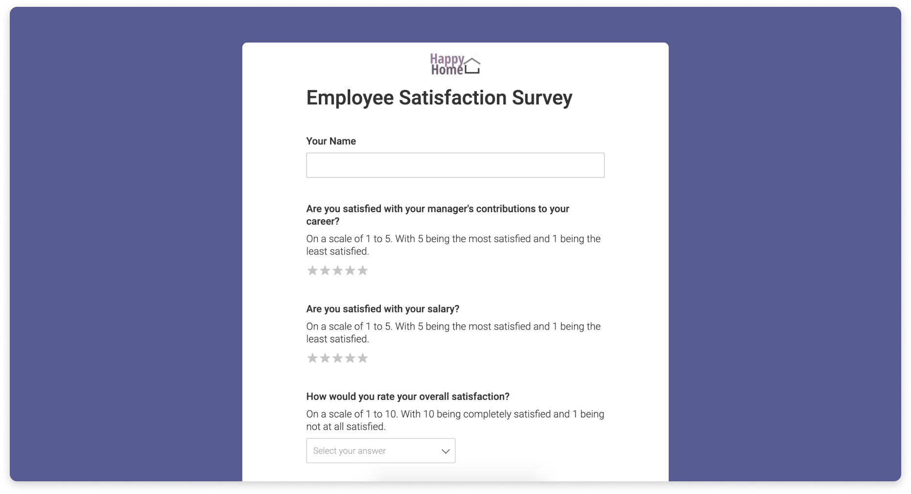
The second board you’ll need is a board for your survey and results. The structure of this board will be the basis of your survey using the Form View.
With Forms powered by monday.com, you can easily set up your survey and send it out to your employees.
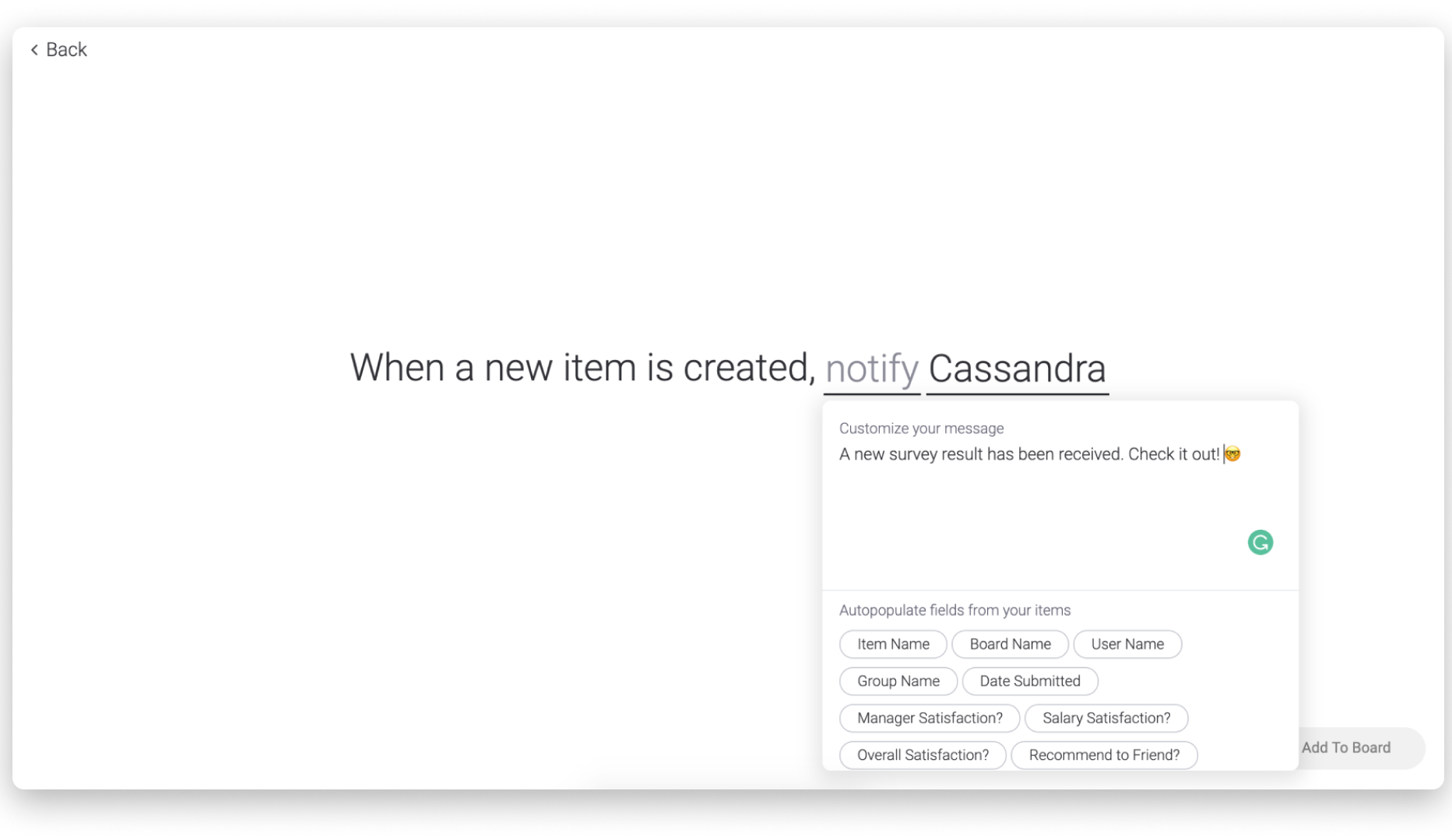
Automate your notifications
Curious to see the results as they roll in? You can set up an automation to notify you every time a survey response is received.
Analyzing your results
To analyze your results, it’s best to build a dashboard. Dashboards are a great way to see a comparison of different data sets all in one place. Here, we are using the chart widget to drill down into the data for greater understanding.
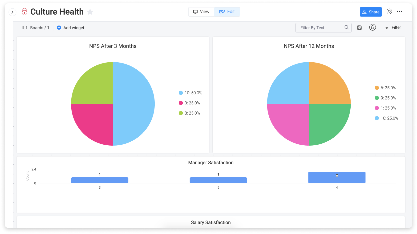
Each chart widget can deliver a different insight. Then you can use the dashboard as a way to get a big picture overview of the company-wide sentiment as well as a breakdown by department. This is the best way to identify high-risk populations in a single glance.
Once you have a clear view of the results of your survey, you can develop an improvement plan to make sure you’re working towards 100% engagement!
If you have any questions, please reach out to our team right here. We’re available 24/7 and happy to help.
Comments